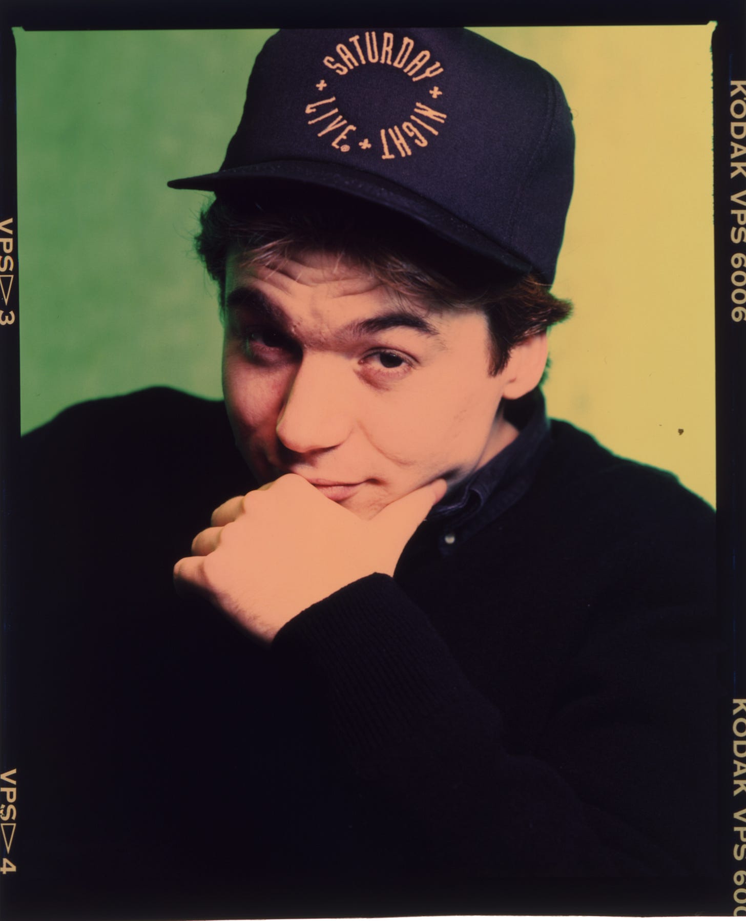
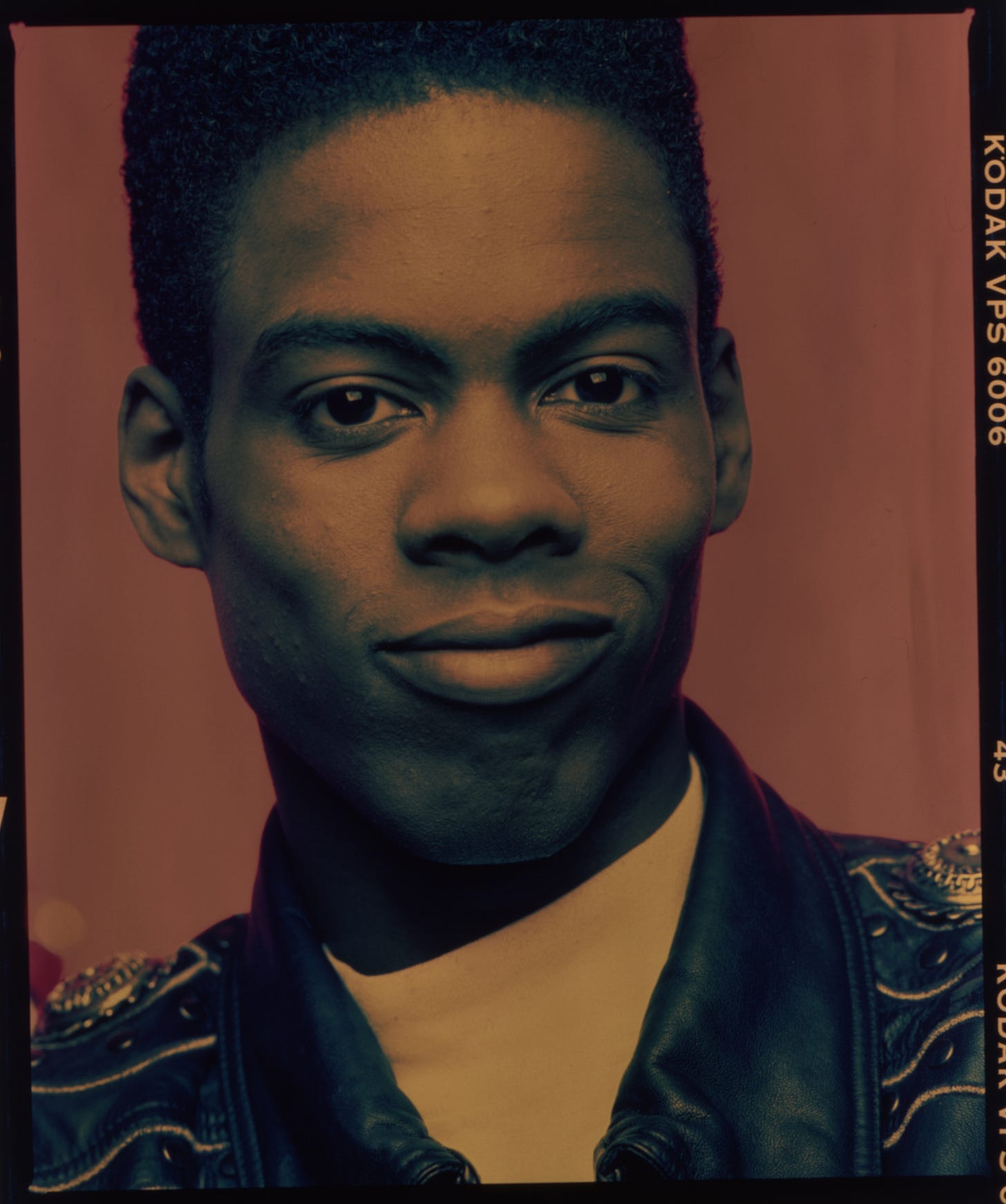
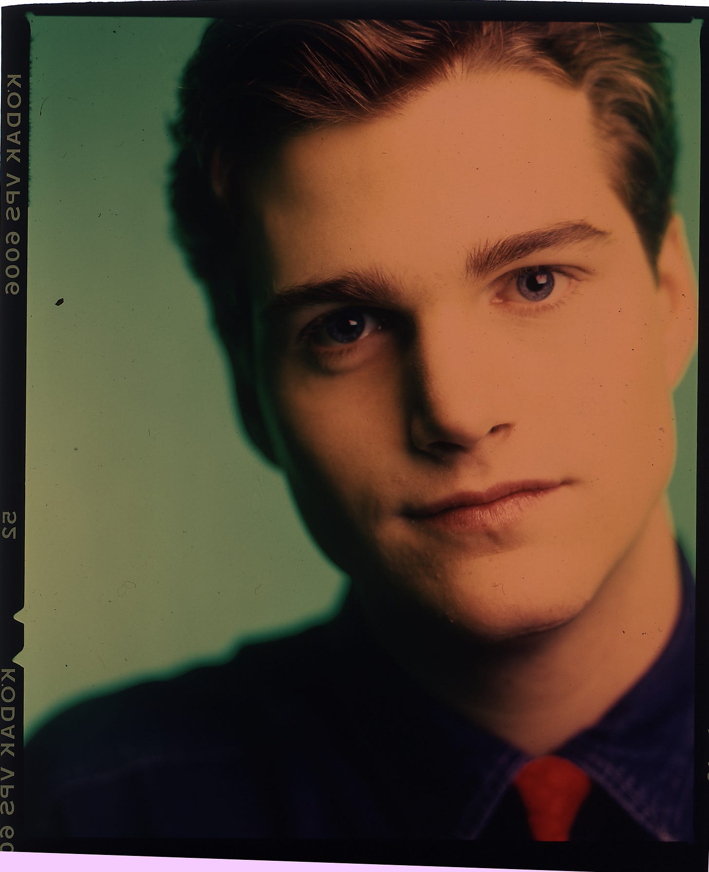
When you look up “film” in the dictionary nowadays, you have to get to definition 3b before you come to the kind of film we were obsessed with for the last hundred years, up until the early 21st century, when we all went digital (well, except the hipsters and artists). Looking back from atop twenty years of digital photography, I don’t think I would have believed the contortions we had to go through to get that image from our minds onto the page you admired on your coffee table.
There were various methods used by working magazine photographers and my workflow was typical. I worked with a medium format camera system made by the Japanese firm Mamiya. This produced a 2 ¼ x 2 ¾ inch image on 120 medium format film. The Swedes also made fine glass for medium format work, known as a Hasselblad. I preferred my Mamiya and it’s 6x7mm format more than the Hassie’s square. Think about it, a magazine cover, the ne plus ultra of cultural relevance is about a 6x7 shape. The camera dudes called it “ideal format.” I could induce my Mamiya to shoot squares, I had backs that attached to do just that. I’ll admit Hassies were probably sharper, certainly a little sleeker, but they would never create a stunning rectangular color chrome like my Mamiyas.
Hassleblads were literally the cameras NASA took to the moon, and left there to save weight on the return journey. Whenever we do get back there, I’m sure that you could pop a roll of film in, wind the shutter, and shoot a tack sharp gorgeously rendered image as stunning as that first image of the Earth shot in 1969. My pal Chip Simons did a lot of prominent work with his Hasselblad and had become friends with people at the company. They gifted him an object which was such a perfect combination of astonishingly cool but ultimately useless. Hasselblad produced a version of the same camera that went to the moon, including the etchings on the rear of the lens that NASA used to measure objects in view. Chip’s camera was exactly the same as the one that went to the moon, including the etchings. So every photo he took with it was sharp, crisp, and had those damn crosses right in the middle of every image. You know the ones, think of that iconic shot of Armstrong on the moon. They’re right there, embedded forever in the shot. So when you photograph your grandmother, well, there are those crosses, perhaps right in the middle of her face. So cool. So fucking annoying. And while on the topic maybe I’ll reminisce oh so briefly how the Mamiya guy once regaled this broke artist with tales of how much free shit they gave Annie Leibovitz. I mean, dude, I get it, but sheesh, read the room, will you?
A perfectly exposed and processed chrome lying on a bright white light table is an unparalleled jewel of perfect gorgeousness. Even twenty years into wondrous digital imaging: projections, large format prints, high res monitors, there is still something about that fragile and temperamental chrome lying there, an ineffable and indescribable wonder. About five years ago, I gave my whole Mamiya kit to a friend’s kid, who now manages an entire photo agency that shoots only film, right here in the digital age. On one level I think she and the rest of the youths are crazy, but thinking on the power of a medium format chrome to render a viscerally affecting image makes me chuckle at the beauty and terror that path promises.
The other thing about film that’s hard to conceive in modern times is that it was one type. If you shot black and white film (like the Tri-X we all used in High School photo classes) you got black and white pictures, no adding color later. Likewise, you shot Ektachrome the shot that came back looked like Ektachrome and only Ektachrome, there was no deciding later you wanted black and white. One of the underheralded and taken for granted facets of modern Camera RAW format images is that you can decide AT ANY TIME, even years later, that you want black and white or nineties’ style cross processing or anything in between. With film you were stuck. Oh, and even then, if you exposed it improperly, or let it get too hot, or left it in the cab on the way back from the airport it was ruined. Ruined, I tells you!
There were two kinds of color film and process available (with Polaroid providing an alternative image track but one generally used for evaluating lighting before shooting the same shot on film for the final art) E-6 and C41. The former provided positive images, known as chromes. C41 produced negative images, which would later be printed to reverse the image into a positive. Upwards of 90% of magazine, album cover, and other commercial work was produced on E-6 film which could then be run at a local lab. There were a plethora of labs in New York and LA of course, but E-6 was ubiquitous enough that you could run your job in Tulsa or Baltimore if you happened to find yourself there needing processing.
To describe how we got to the point of admiring that beautiful jewel of a chrome glowing off the light table, rewind the movie: back through the lab, to how that film is handled after the shoot, to the shoot itself, finally all the way back to the transformation of petroleum into film which can then be coated with a light sensitive emulsion. If you were paying attention, you’d note that the manufacture of modern photographic film is something only a giant multinational corporation can pull off. No scrappy garage startups, no, you need a company like Fuji Industries or Kodak. And when you begin to pick and pull at that product to make it do things it’s not supposed to, well, you were mostly on your own.
I don’t know who gave me the idea to try to “cross-process” film, maybe my contact from the color lab? Photographers were always trying to get different looks from the available film and processes. Chip Simons used brightly colored filters and light painting to achieve his totally unique look. Duane Michaels used a technique in the darkroom that presaged the kind of manipulations done later in Photoshop. Commercial photographers like Annie Leibovitz and Mark Seliger were developing lighting techniques, applied to locations and even outdoors, to give an immediately recognizable look to their photos. Casting about for ways for me to achieve a distinct “look” for my pictures I began to experiment. What if you ran E-6 film in C-41 chemicals, or vice versa, C-41 film in E-6 processes?
“You can’t do that!” my contact at Fuji assured me, “It will ruin the chemicals and maybe the whole machine!” One way to read this tale is as one of corporate intellectual property rights. Remember, this stuff, running film, was part of, indeed required an enormous vertically integrated manufacturing concern. Neither Fuji nor Kodak had any interest in a bunch of rock and roll artists figuring out new ways to abuse and confuse all their carefully calibrated processes. The chink in in the armor was provided by the licensing of Intellectual Property, particularly the E-6 protocol. I had originally worked with a color lab on 20th Street called Duggal. They comprised four floors of intense image making activity. It was common to bump up against people editing jobs for major corporate clients or be literally rubbing elbows with other photographers as they’re editing their jobs as God intended: with a china marker on chromes sitting on a light table. But they were not the kind of place that felt like fucking with their bread and butter. That was left to the upstarts, like Soho Color. They were much more interested in trying something to get the business of an upstart local photographer, even if it might endanger their chemistry (thus making it right-out for someplace like Duggal).
Alright, you got this straight? Two kind of color film, two kinds of processes, like Reese’s Peanut Butter Cups we’re going to mix and match. I did eventually work extensively in C-41 run in E-6 (which yielded a negative you had to subsequently print), but initially found most promise in the reverse, C-41 (print) film run in chrome chemistry to yield a positive chrome image, but one with radically shifted tonal values. The first rolls I shot this way yielded just enough potential to seem interesting. But learning to control it enough to be able to deploy it on one of these high stress celebrity editorial jobs was another story.
For starters, it really did seem at first there to ruin the chemistry. Soho Color changed their chemicals every day. So they agreed to run my cross processing experiments the last run of the night, right before they were throwing away the chemicals anyway so it wouldn’t matter if they were ruined. Eventually, it turned out this was nonsense, and labs everywhere started offering cross-processing.
In those days, I was working with fellow photographer Patricia McDonough. We quickly determined that it was utterly possible to create stunning and unique images this way. The trouble was being able to control it. Sometimes it would be amazing, others unusable and there seemed no in between. How to wrangle those poles enough to be able to use this technique on a commercial job was the trick. Patty and I shot roll after roll, carefully tracking what we did and how we did it, then crossing those criteria with the final shot. I mentioned two types of color film, which holds generally true, though within those two genres are many variations. We ran them all, I have the sheets and sheets of results to prove it.
First, choose your film. Each of the C-41 color negative films from Kodak and Fuji have their own characteristics and needs. Kodak VPS processed in E-6 reacted (and looked) very differently from Fuji100S chrome film run in C-41. And you had to do diametrically opposite sorts of things to them.
In High School, I had seen a gallery show of black and white prints by landscape photographer Ansel Adams. While the pictures were compelling, the prints themselves were absolutely astonishing. Like that scene where Meg Ryan explains faked orgasms to Billy Crystal and Carl Reiner’s mother exclaims, “I’ll have what she’s having!”, those prints rocked my world. I was just learning to run Tri-X in my crappy yearbook darkroom and Ansel’s giant prints, man! Blacks so deep and varied, luscious mid-tones, and highlights to make you cry. I found myself in art school in Penland, North Carolina a couple years later with a teacher who had been a long time assistant of Adams’, Ted Orland. Orland illustrated how Adams' strength, the reason he could produce those astonishing prints, was a deep understanding of the technical aspects of image production. What is the whitest white, the blackest black your chemicals and paper were capable of rendering? But more, what is the slightest amount of less white, more black, so that you retain detail. A black and white photographic print contains 256 shades of grey, from the blackest black the paper can produce to the whitest paper white. The human eye sees 450 distinct shades of grey. Translating the real world into a negative, then a print, requires being able to exactly exploit the characteristics of that particular film, camera and lens combination.
“The reason your prints suck is you’re working from a shitty negative.” Orland had upbraided me in sensitive seventies style. The way to achieve good negatives is to expose then process them correctly. Then process them, write everything down, repeat your actions with military precision, then dispassionately analyze the results. Another aspect of this, in the walking barefoot uphill both ways to school is that digital cameras nowadays record this information on every shot, sigh so you could do all this without writing anything down.
When I began to experiment several years later with cross processing color film, I remembered Orland’s entreaty, changed my natural inclinations and behaviors radically and got scientific. Roll after roll, me shooting, Patty patiently sitting still writing down what we were doing then running the jobs overnight as the last run at Soho. Over a period of months we began to figure it out. The nicest and most dramatic effect initially (we would later deduce several combinations which worked well) was VPS in E-6 chemistry.
However, that was the least of it. You’ll recall we had to light everything in those days anyway, all the more so for this stuff. First, had to put colored gels on the lights, often several vibrantly differing colors. Then a radically colored filter (like 3x tungsten or something) on our lens. Reset the light meter to allow two to three times more light than usual. Then push it two stops in the soup. We eventually figured out some four or five variations, each arrived at through months of grinding, precise, scientifically controlled shooting. So totally counterintuitive for a couple of dreadlocked loft dwelling artists perverting the scientific method for their own evil ends.
I worked with Patricia for several years, and she is still one of my closest friends. At the time, we had matching dreadlocked hairstyles. On more than one occasion my mumbling though well mannered delivery of, “This is my assistant, Patricia,” would be misheard. About half way through the shoot, a bemused subject would sidle up and say sotto voce, “Wait, I thought you said she was your sister…” Patricia would herself go on to make effective artistic use of many of the techniques we developed. Months of midnight lab runs and failed attempts slowly yielded enough consistently reproducible results to perhaps apply on a commercial shoot.
The first big commercial shoot I involved cross processing on was Iggy Pop, for Rolling Stone, which I will detail in another chapter. In closing here, I will note that once we did figure it out, cross processed imagery became a staple of my commercial career. Look around this page for some examples of the types of look and subjects I used it on. After a couple years there were so many cross processed images that I and many others moved on, started leaving the filters at home and began shooting a lot more daylight.
I went fully digital in August of 2003. And was bemused to note with the advent of the iPhone and its apps, that all our hard work figuring out how to make film and chemistry do things they weren’t designed for got distilled down to an app. For the princely sum of $2.99, one could purchase Hisptamatic, an app that made your pictures look cross processed. Particularly ironic, as I was an enthusiastic early adopter. But now I look at the couple years I used it and cringe: the Hipstamatic era seems to have run hotter and quicker than that of actual cross processing. I have a certain nostalgic attachment to these sorts of pictures, but quickly came to agree with my kids and their “God, Dad!” mentality and knocked it right the heck off. So next time you young whippersnappers with your fancy apps are producing cross processed imagery just recall your elders, slaving away in the lab late at night before dumping the chemicals. And laugh at how totally anachronistic all that was just to produce some pictures that a $2 app will turn into a cliché that you can’t even stand not two years later. And then get off my lawn.


